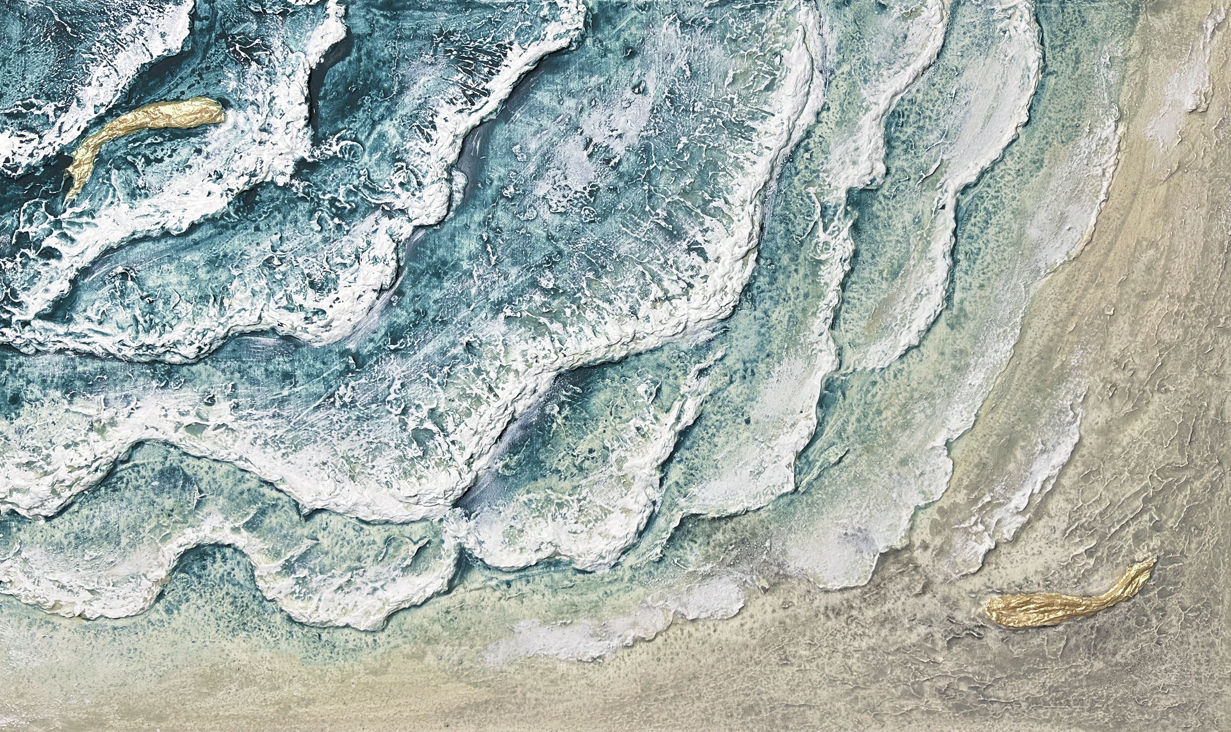
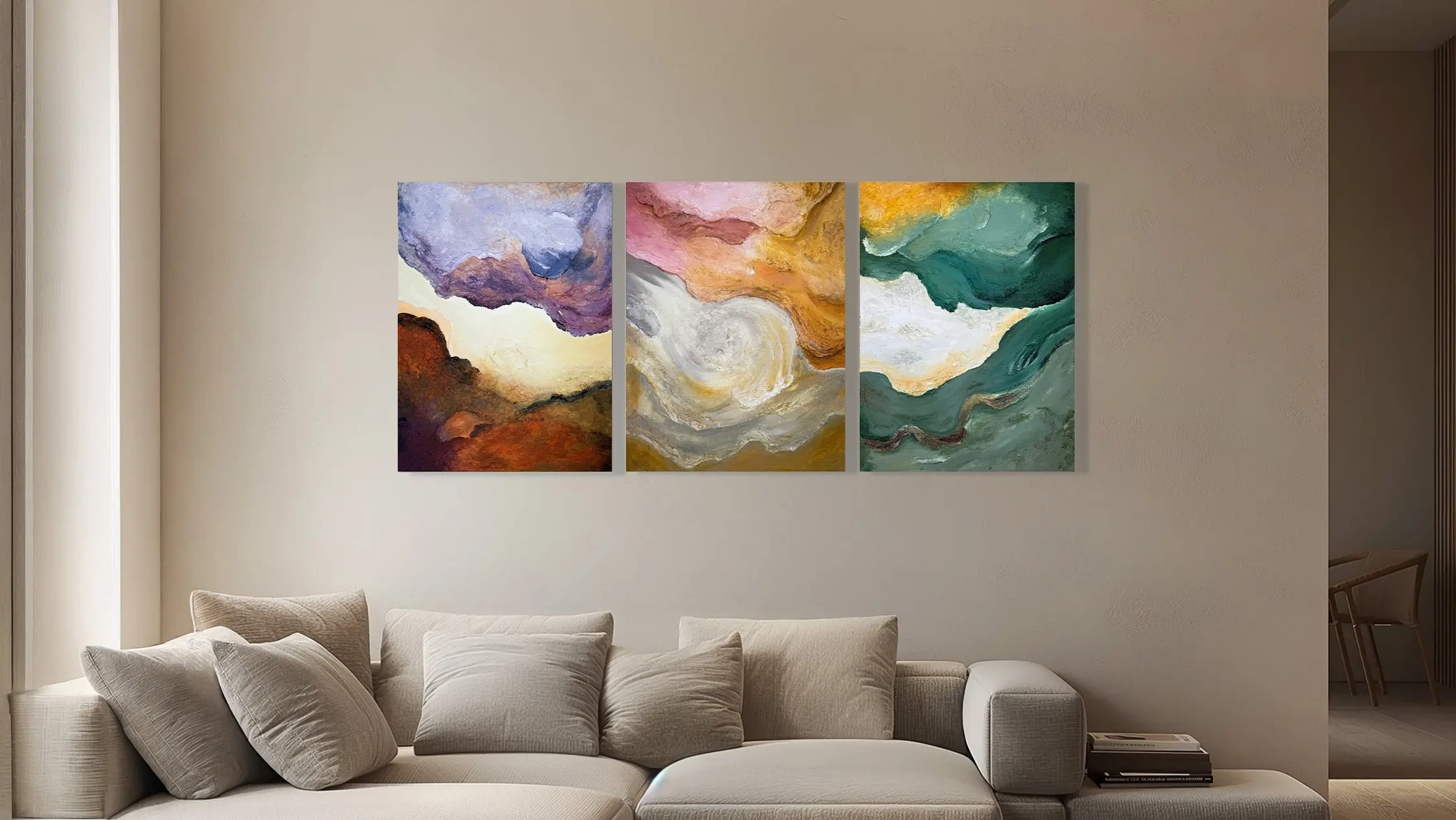
To choose an abstract painting, first notice what makes you pause: a movement, a balance, a contrast or a surface. You do not need to recognise an object to feel a connection. Then consider whether that presence continues to interest you from a distance and whether you want to encounter it in your space, in its light and throughout your day.
Look before seeking an explanation
Spend a moment with the image before reading the title and description. Follow the areas that attract your eye and those that let it rest. You might notice a vertical direction, a pull to one side or a denser centre. Describing what you see in simple words helps you understand your preferences.
Reading the artist’s account can add meaning without requiring you to feel the same thing. Keep the work’s origin distinct from your personal response. You may enjoy a painting for its compositional rhythm even if its starting point is far from your own experience.
Compare movement, pauses and density
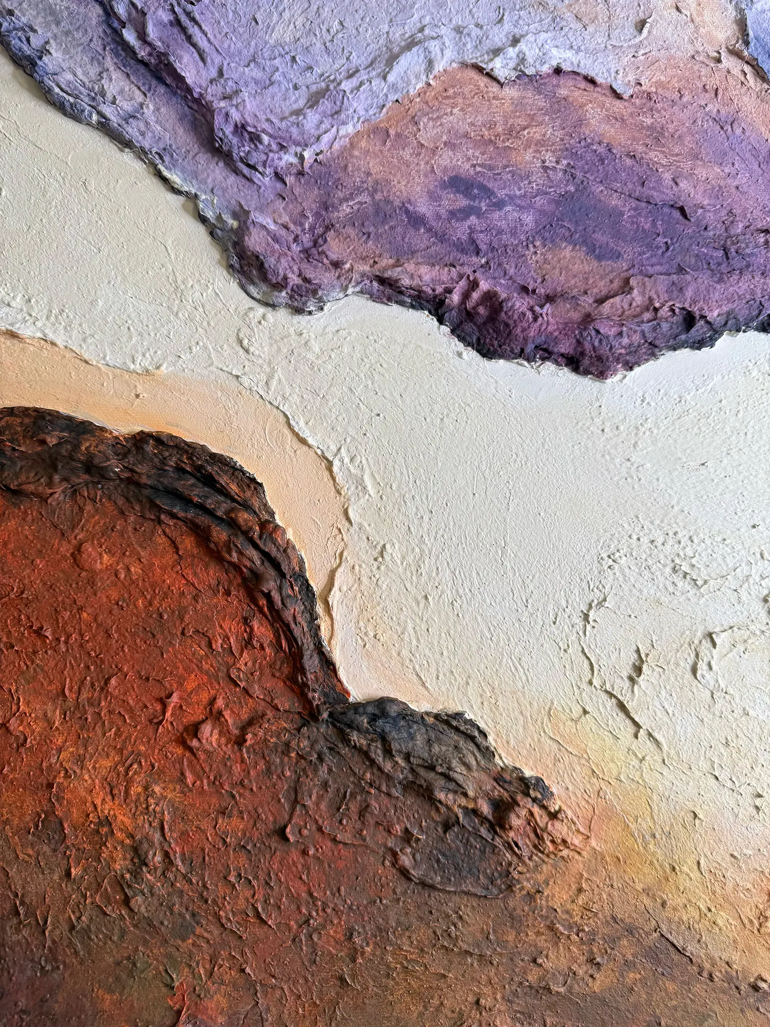
Place two or three works you like side by side and consider how your eye moves. In a composition full of marks it may jump quickly between points; in one with large colour fields it may linger. Neither is better: they create different kinds of presence on the wall.
Consider the less worked areas too. A quieter passage can make a group of intense marks easier to read. Choosing only the most striking detail in a photograph risks overlooking the relationship between parts. Always return to the whole image and ask whether its overall balance convinces you.
Distinguish abstraction from texture
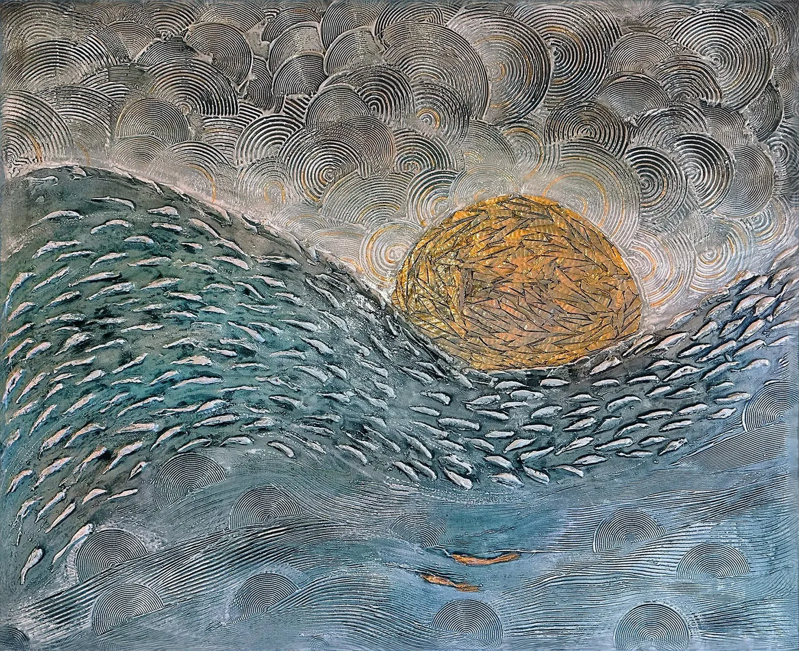
Abstract and textured describe different aspects. An abstract painting may be smooth or heavily raised; a figurative painting may be strongly textured. If you want a work without a recognisable subject, you are describing the image’s language. If you are interested in thickness and physical marks, you are describing its surface.
This distinction makes the conversation with the artist more useful. Rather than asking only for a modern abstract, you can explain that you want broad movement, few colour transitions and subtle texture. These references help select works or develop a commission without reducing it to a label.
What does textured painting mean? →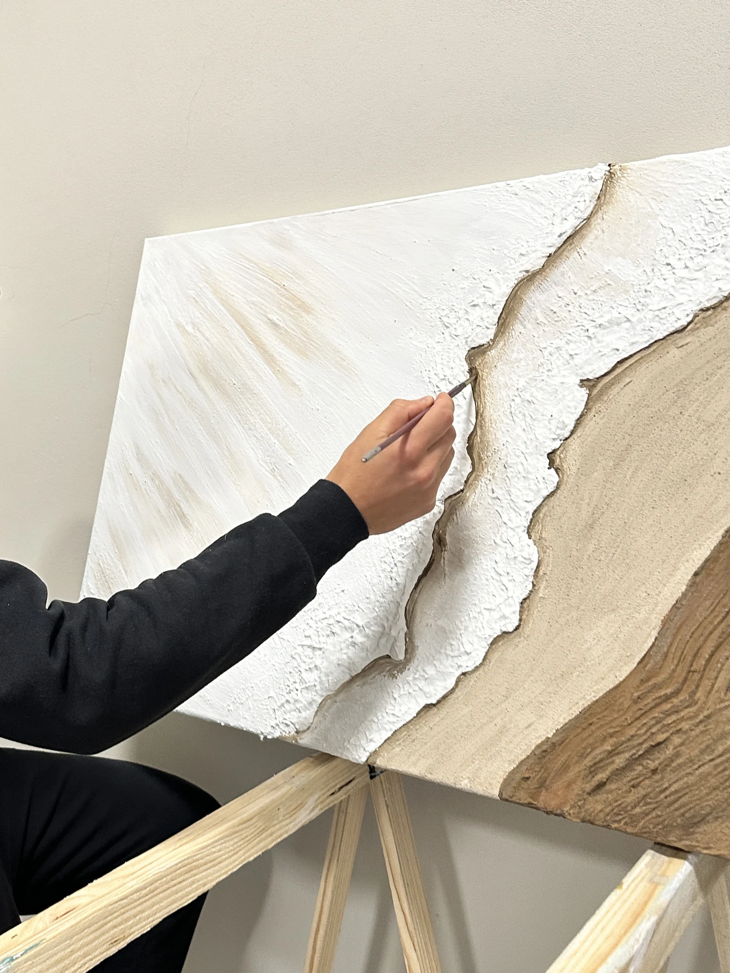
Imagine the painting in your daily life
The wall and viewpoint change your relationship with the image. A complex composition seen up close every day may offer details to discover; from a distance you may mainly read its larger masses. Test the overall dimensions and look at the wall from the places where you actually spend time.
In Tre Viaggi, three shared experiences became a composition across several panels. It shows how a personal reference can be interpreted through colour and texture. Explore it to understand the approach, without expecting another project to repeat its subjects or solutions.
Read the story of Tre Viaggi →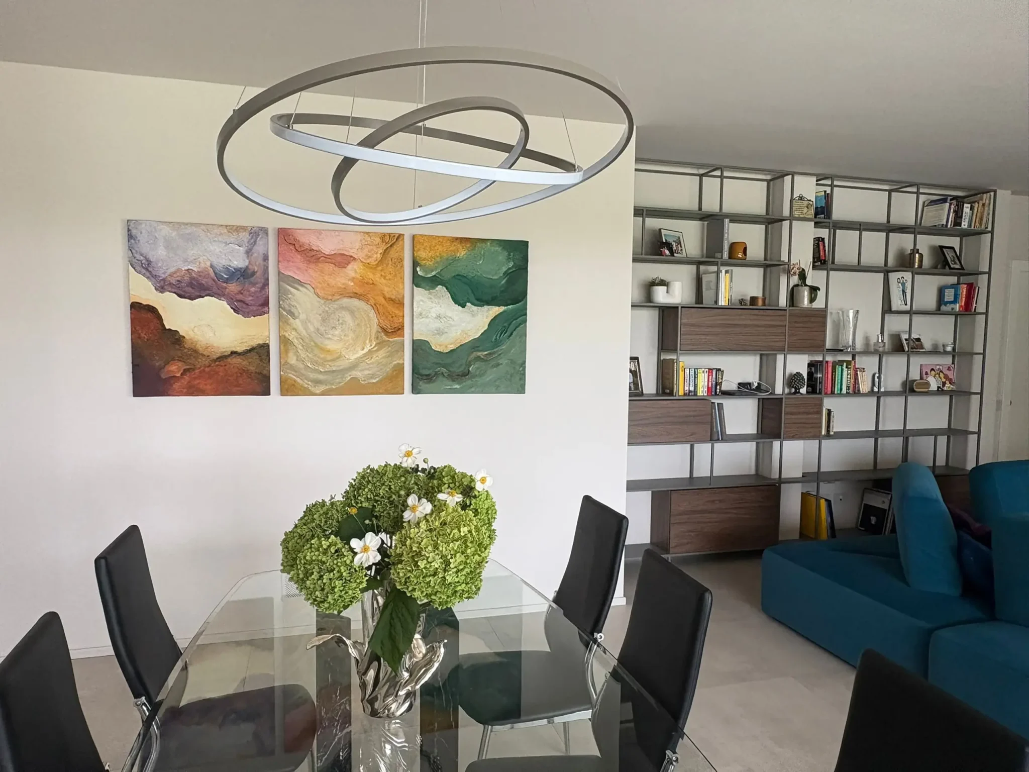
Choose with criteria you can explain
After comparing, write down three reasons you prefer one work: the balance between full and open areas, a colour, the direction of the marks. If the only reason is that it matches the rug, look at it separately from the furniture. Ask whether you still want to spend time with it.
For a commission, collect a few references and describe what interests you in each. Mention anything you do not want: strong contrasts, very glossy surfaces or an overcrowded composition. A clear brief gives the artist a readable direction and makes discussion of proposals more useful.
Consider the relationship with your home’s colours →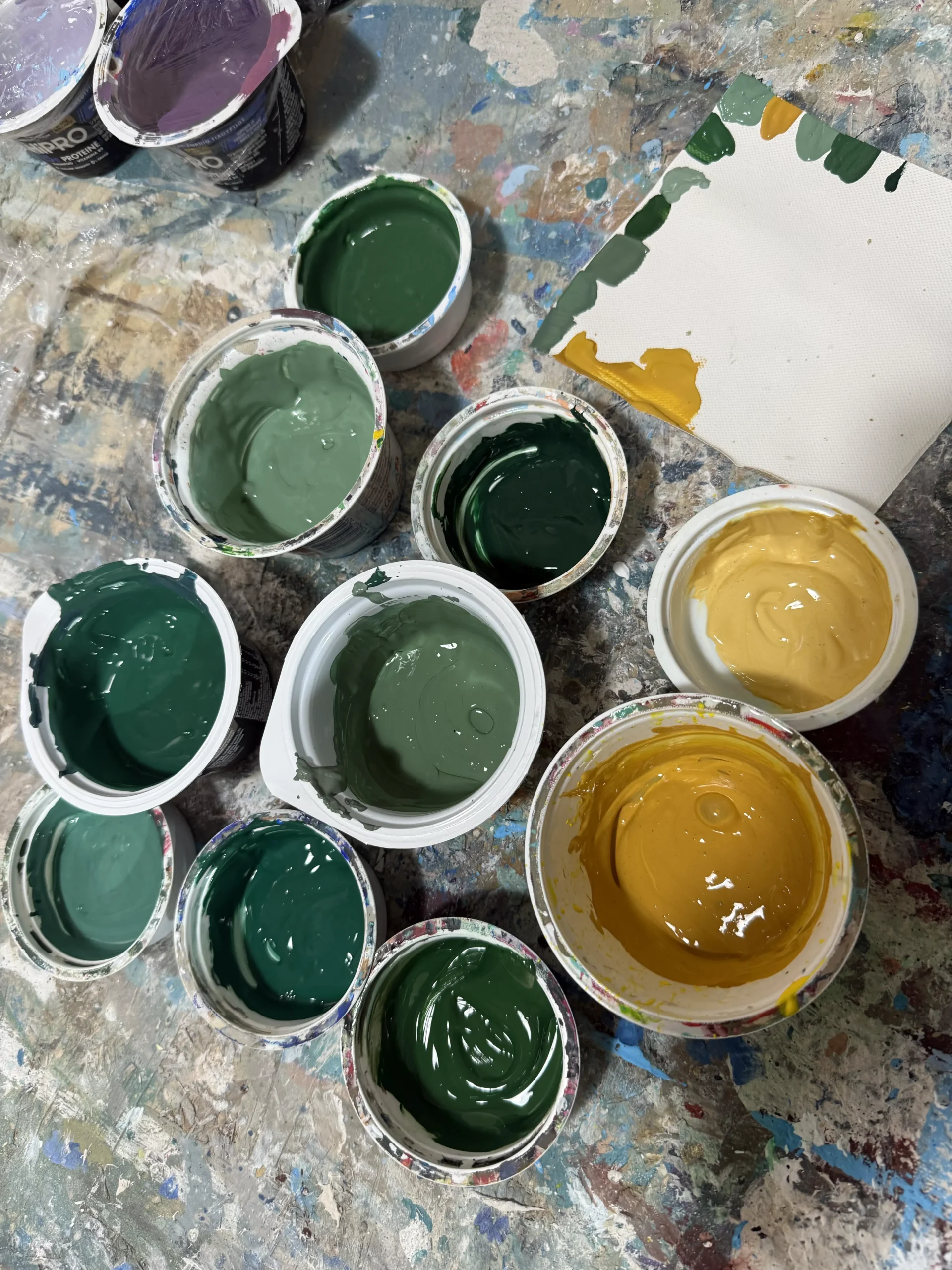
You can begin without knowing the vocabulary of abstract art. Show us two works that catch your attention and tell us what you want for your wall: we will start the conversation with what you see.
Let’s find a direction for your painting →