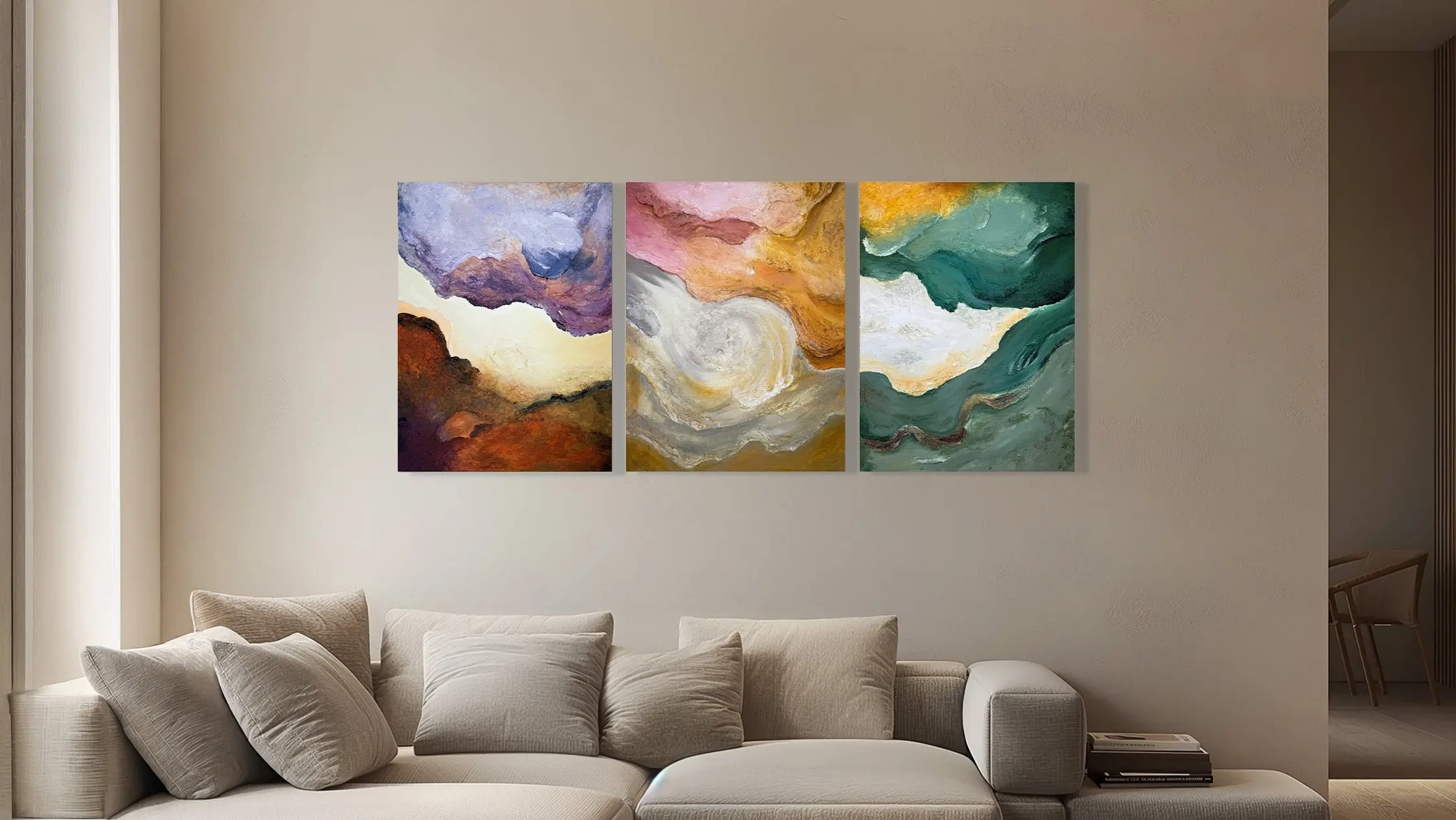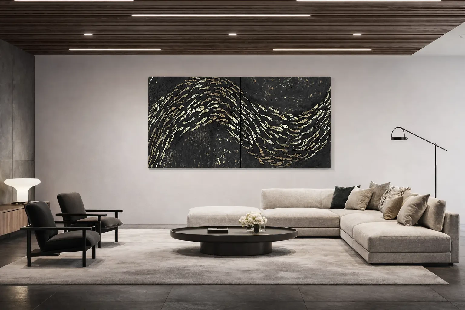
To choose a painting for an office or study, start with how the space is used: desk work, receiving someone, holding a meeting and appearing on video calls require different considerations. Identify the wall, viewpoints and character you want to convey. Then compare subject, format and surface with furniture and light, without expecting an artwork to automatically produce concentration or productivity.
Distinguish a personal study from a shared space
In a personal study, you can give more room to references that matter to you: a subject, a place or a visual language you want to spend time with. In a shared space, gather other users’ needs and consider elements that must remain visible, such as signs, whiteboards and work tools.
Before choosing, describe the painting’s role. It may accompany a waiting area, give character to a free wall or create continuity between rooms. Assigning it every role at once makes the request unclear. Identify one priority and use it to compare proposals.

Look at the wall from the workstation
A wall that looks clear on entering may be partly hidden by a screen when you sit down. Check the actual viewpoint before deciding height and format. Consider bookcases, shelves, cables and lamps too: the painting will relate to a working room, not only an empty photograph of it.
If the work is in front of you, consider how present you want it to be while working. If it is behind you, you will mainly see it on entering or standing up. This difference can guide the choice between a detailed composition and an image readable from a distance.

Check the video-call background
For a wall behind the desk, test with your usual webcam. Framing may crop the artwork, mirror the preview or show only a fragment. A painting chosen for the room should work in that space first; its appearance on video is an additional check.
Check whether a reflective finish creates a bright patch and whether the light on your face conflicts with the painting’s lighting. You can adjust framing or lamp direction before changing the subject. Keep two images of the test to explain the issue during design discussions.

Reception and meeting areas need an overall view
In a reception area, a work is often seen first on entering and then while seated. Compare both views and keep routes, doors and useful signs clear. In meeting rooms, consider screens, tables and fitted walls: a composition may work better on a side wall than beside a presentation.
The subject can relate to the business’s identity without repeating its logo. Colour, rhythm and texture offer different possibilities. If several people decide, gather a shared brief and establish who will approve the proposal: this helps turn different preferences into useful design guidance.
Explore colours in relation to furnishings →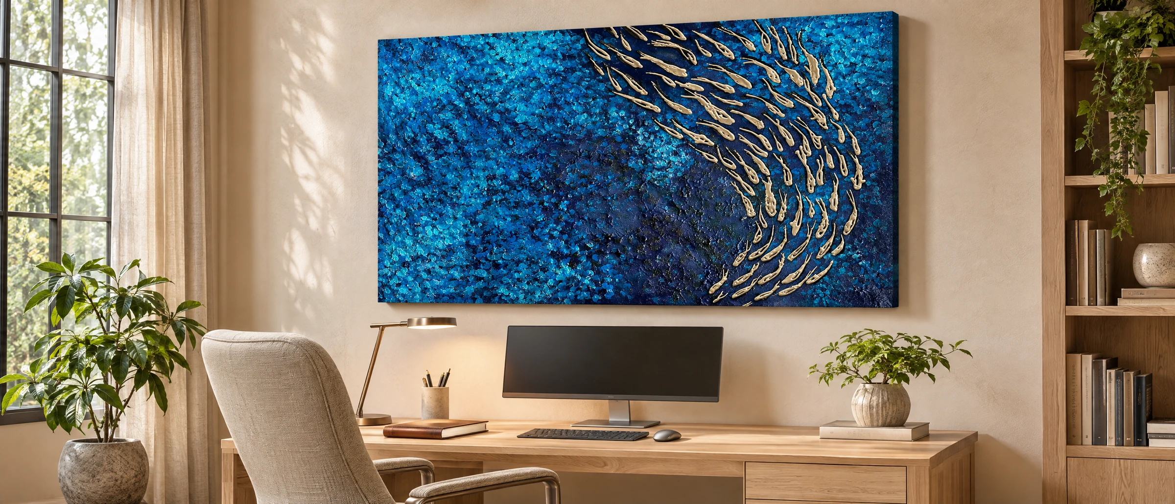
Prepare the information for a commission
Gather front and wide photographs, wall measurements, light positions and the room’s intended use. Add a budget indication and any opening or handover date. If furnishings are still being planned, distinguish confirmed choices from provisional ones so the painting is not developed around information that will change.
Quadri su Commissione also works with professionals on residential and commercial interiors. During the consultation, we can discuss how the artwork fits the project, who will gather feedback and which stages need approval. Interior previews help assess the painting’s presence before it is made.
Explore the process for professionals →
Are you choosing an artwork for your study or an interior project? Tell us how the space is used and which choices are already confirmed: that will be the starting point for our discussion.
Let’s discuss your workspace →