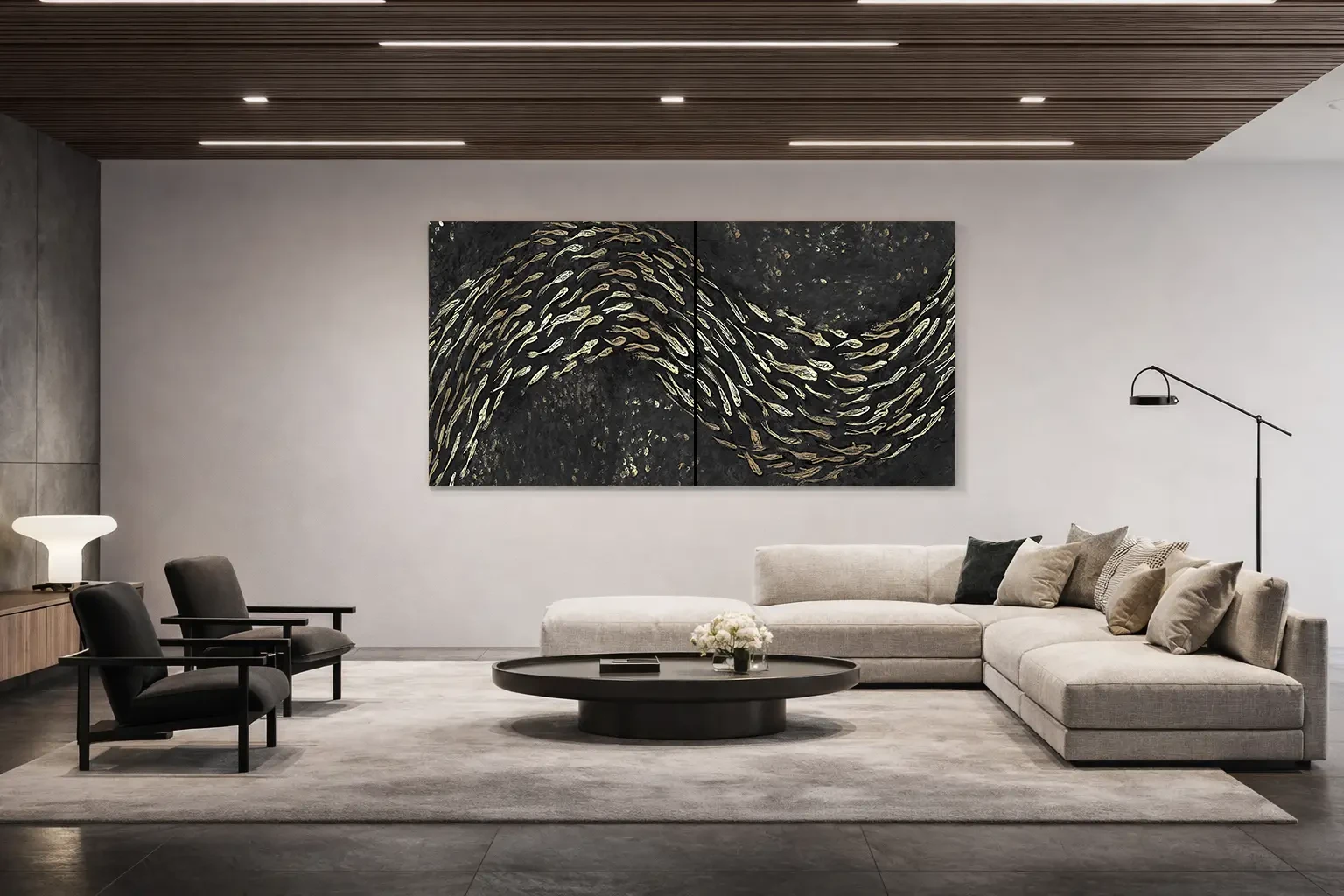

To match a painting’s colours with your interior, first identify the tones that occupy the most space in the room. Then decide whether the artwork should echo one of them, introduce an accent or create a contrast. You do not need a canvas in the same colour as your sofa: consider the relationship between surfaces, light and what you want to look at every day.
Start with the colours already in the room
Look at flooring, walls, curtains and furniture before small accessories. Warm wooden flooring and a cool grey wall, for example, already create a colour relationship. Photograph the space from the doorway and from where you sit: the images will make it easier to distinguish dominant colours from those that appear only in a detail.
Choose two or three references to bring into the project without turning them into a rigid formula. In a neutral interior, a painting can become the main colour accent. If rugs, books and textiles already make a strong visual statement, consider a composition that gives the eye somewhere to rest.
Choose continuity or contrast
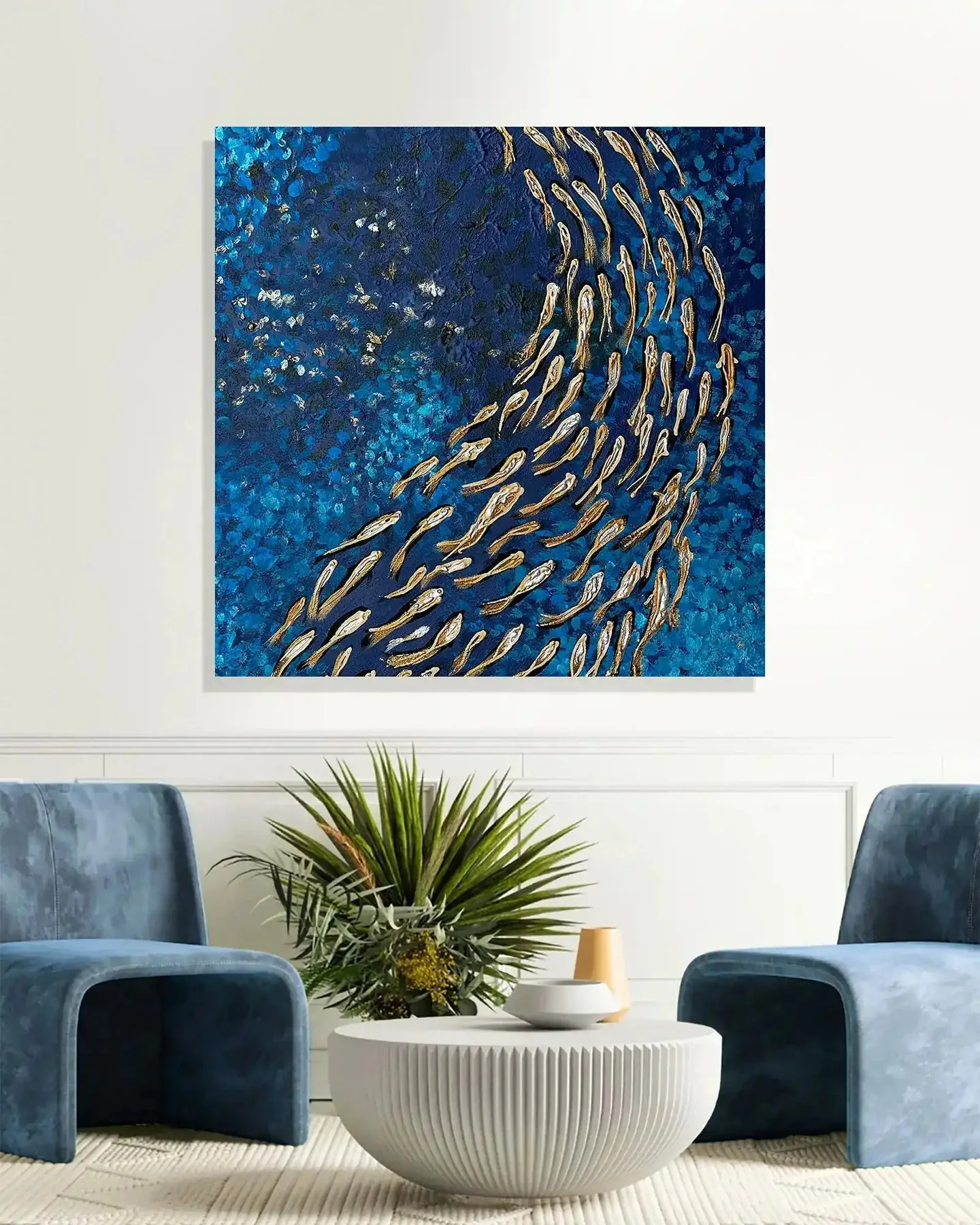
Continuity comes from repeating a tone from the room while varying its intensity, brightness or proportion. A green found in an armchair might reappear on canvas as a lighter passage. The whole remains connected, while the painting retains its own composition rather than becoming a fabric swatch.
Contrast introduces a visible difference: a dark passage against a light wall, or a warm accent in a room dominated by cool colours. Imagine where your eye will go as you enter. If the artwork becomes the room’s strongest visual focus, consider whether that is the effect you want.

An example: warm wood, light walls and blue
In a living room with warm wood and light walls, you could explore a seascape with blues, earth tones and luminous areas. The earth tones connect with the floor, while blue introduces depth. This is one design possibility: the same room could also suit an almost monochrome composition if you prefer a quieter relationship.
In the Cala Goloritzé project, the landscape meets a wall between the living area and kitchen. Looking at a complete project helps you assess colour alongside placement, subject and format. Use examples to understand what appeals to you, then check your choices on your own wall.
Explore the Cala Goloritzé project →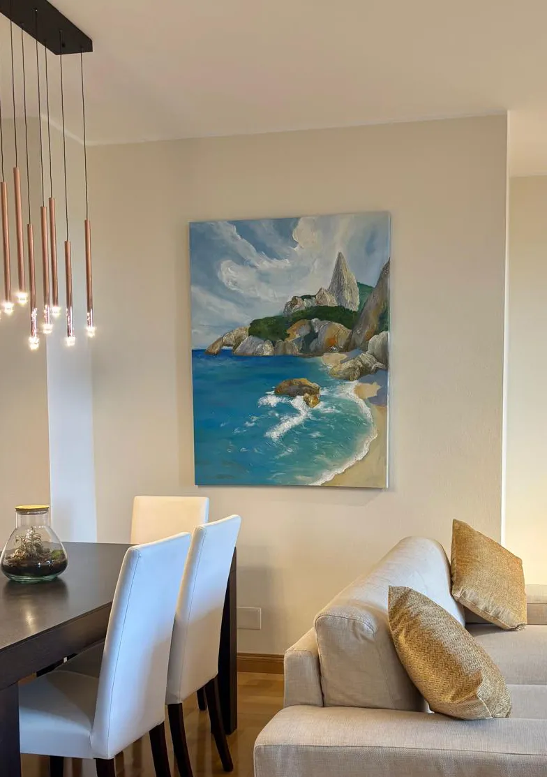
Check colours in the actual light
A phone photograph is useful for discussing a direction, but it does not reproduce a painting exactly. The screen, exposure and room lighting can change perception. Collect photographs of the space by day and in the evening, avoiding filters that artificially warm or cool the colours.
With a textured surface, also consider shadows and reflections. A metallic detail can look subtle from one position and striking from another. Before choosing from a thumbnail alone, ask for full views, close-ups and information about the lighting in which the artwork was photographed.
Explore lighting a painting →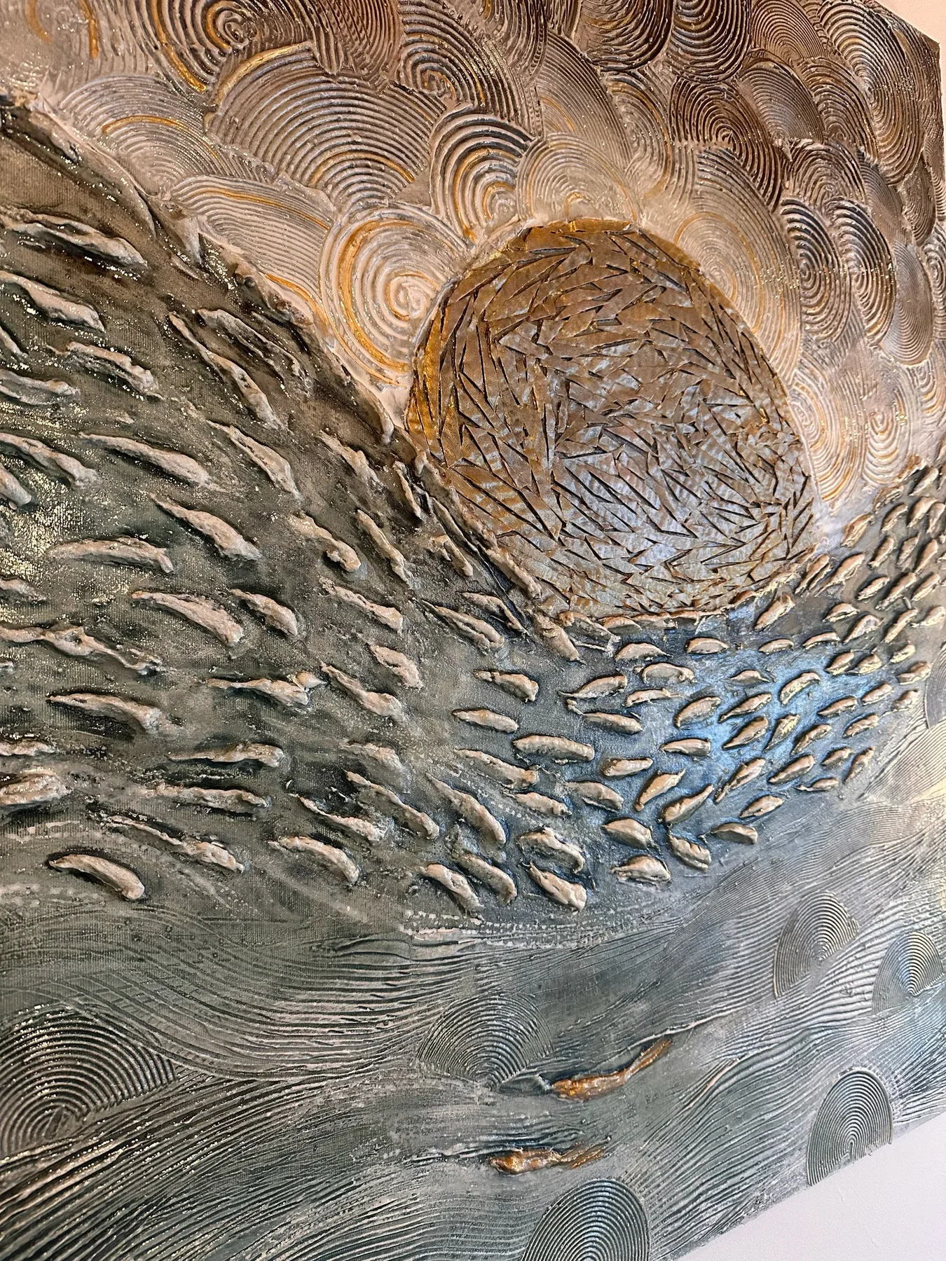
Mistakes that make matching harder
Choosing a canvas simply because it contains the colour of the cushions overlooks the visual weight of everything else. Trying to repeat every colour in the room can also create a confused result. It is more useful to identify one main relationship and let the other colours play a supporting role.
Before deciding, compare two clearly different directions and describe what you prefer: more brightness, a stronger contrast, fewer colours or more movement. In a commission, these observations become practical guidance for studies and the preview in your interior.
Also consider proportions above the sofa →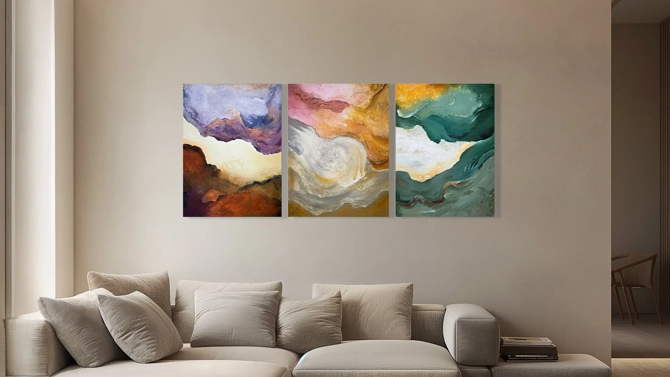
To explore the colour of your painting, collect a wide photograph of the room and two references you like. During the first meeting, we can compare the palette with the light, furnishings and character of the artwork you have in mind.
Let’s discuss the colours in your space →